Just to be clear with you, the title of this blog post contains a clever coded Shakespeare reference. I know we live in a debased age, so I thought I’d mention that. The reference contains a clue to my feelings about McNaughton’s work.
But this is not about my feelings!
This is about the fact that McNaughton, who is to all appearances a detestable man, can paint. He can! It matters not one bit that you hate it. The point is that it’s well painted.
The idea that artists have automatic a priori insight into humanity is false, ridiculously false, Olympic-level gutbustingly chestburstingly false. Artists are people, as a general rule, who spend the vast majority of every day looking at a piece of paper. Indoors. By themselves. Why anyone would think that this means they have a mystical understanding of society is beyond me. I’m not even sure they should be allowed to vote.
But that doesn’t mean that they don’t know how to make art!
And the production of visual art is, to a tremendous degree, a well-designed science. Our ability to communicate through visual design is nothing short of astounding. I just watched my newborn daughter, over the last year, learn to identify and interpret visual artifacts with rapacious speed. I couldn’t believe just how quickly she learned what a movie was, what a picture of a dog was. Just yesterday (she’s fifteen months old now) she saw a clay garden sculpture of a bunny and correctly interpreted it to be a representation of an animal, an animal that she had seen before, but only in other artistic depictions such as the movie Bambi.
Pretty fascinating stuff.
You can know a lot about how the eye sees things without knowing anything about how society works. Here, let me “illustrate” this concept for you:

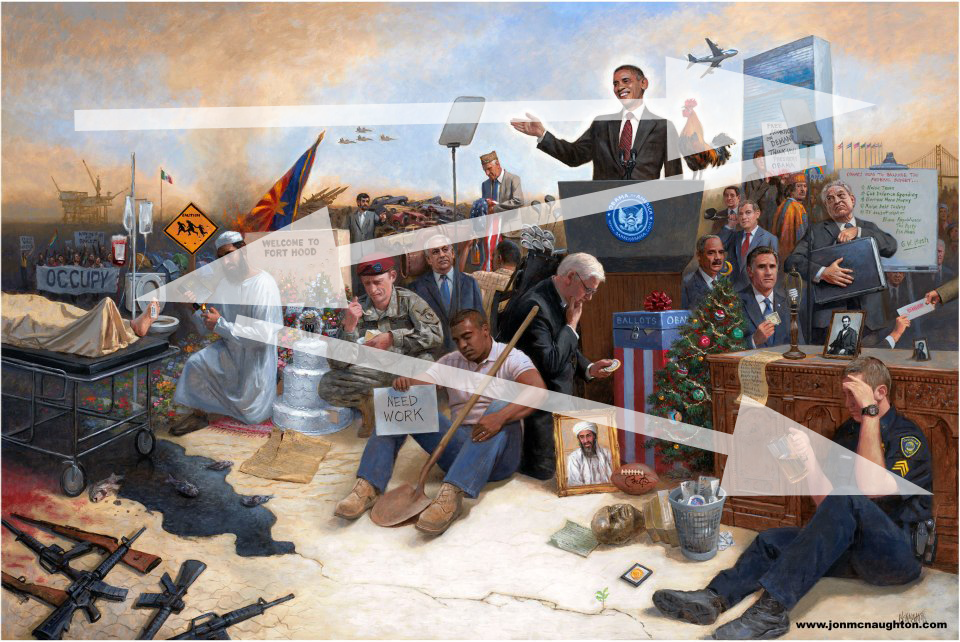
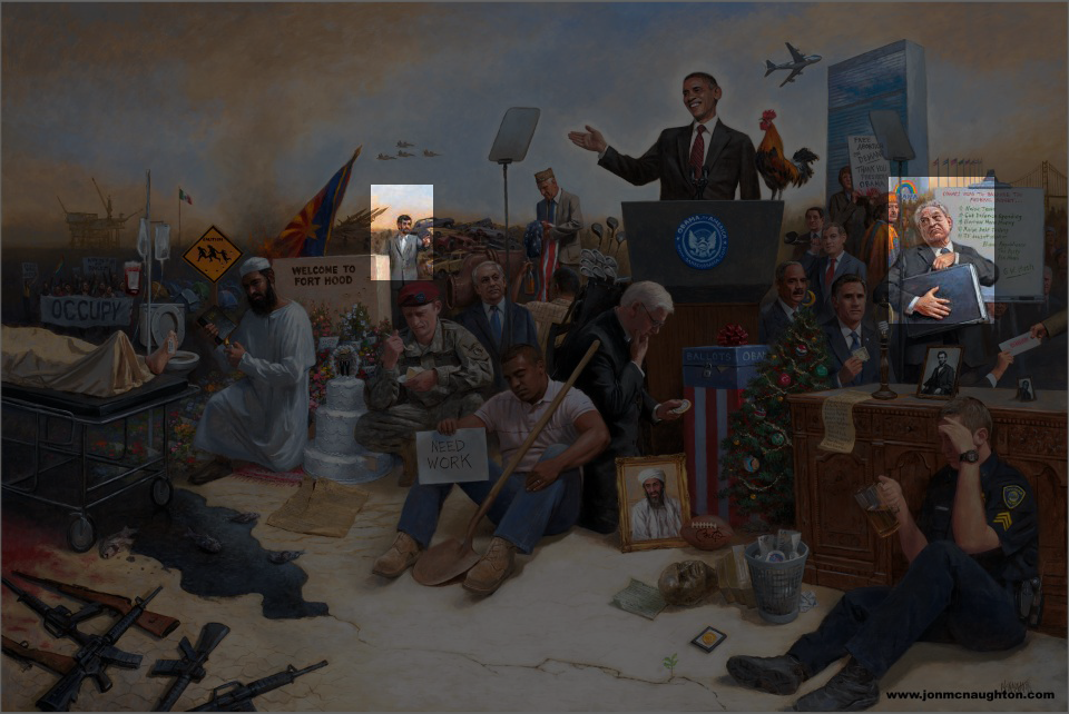
Jon McNaughton*, everybody. This painting is called “Obamanation,” which I’ll remind you is a phrase that I personally coined back in 2007 because it was so freakin’ obvious and I wanted to get there first. But am I complaining? No. I am actually quite impressed with this guy’s mastery of composition.
The human eye is drawn from lightest object to darkest object and then to the next, nearest lightest object and then darkest object along a path. What I mean is that the eye travels from one object to another in a picture, slowly getting drawn further in. When you first look at a picture, your eye takes it all in at once and then focuses down as you begin to enjoy what you’re looking at.

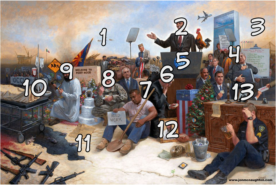
And this is nice! This is nicely done, it’s a good and clean path. But he uses it in a very, very interesting way. See, he’s not trying to make you like this painting. He’s trying to make it weird and disturbing and upsetting. You’re supposed to pass through the painting along the eyeline, taking in all sixty symbols* that he painstakingly has encoded here. But it isn’t supposed to be a pleasant journey!
Usually people look where other people are looking. We extend that courtesy to imaginary people on pieces of paper and computer screens. One of the basic tricks of composition is to have the characters looking where you want the viewer to look.
But in this painting practically everybody is looking against the eyeline. You’re fighting the gazes of all these men (no women in Obamanation) as you move through the painting, and it’s subtly upsetting and uncomfortable. There are only two people who are looking along the direction of motion.

That’s the former President of Iran and George Soros, the prominent liberal financier.
Everybody else is pretty miserable with the way things are going.
This is a good trick! It’s hard as hell to make a path so strong that even all those eyes can’t turn it away.
Let’s describe the path in words, and then look at it and you’ll see what I mean.
You start at the top left, because we’re a Western culture that reads from the top left-to-right and you better believe that influences how we approach art. You follow the burning sky across, helped pointedly by the flag and the arrow of airplanes, only to run into the teleprompter wall and the sad veteran. But then Obama’s glowing hand brings you in, and look how white the halo around him is. That’s not because he’s holy, it’s because the painter wants you to see him, and his suit is painted very dark to bring you across to the rooster, which is curiously balancing him like an extra arm. The plane and the building take you across to the next bright spot, where you pick up George Soros. But then the guy in bright orange catches your eye and pulls it down and you go under the podium, following the neutral faces with their neutral gazes, the blue seal on the podium (only bright blue in the painting), and the white hair of the guy who I assume is not Jimmy Carter. Note how dark the back of his suit is. When McNaughton wants you to look somewhere, he makes it very light and then very dark. The shovel provides the path out of his suit, but then the shoulder catches the eye — our eye does not actually travel all the way down the shovel!
Do you know how clever that is?!?!
Okay, let me catch my breath. Let’s get back to the painting.
We were looking at the exact center of the painting, where the shovel hits the shoulder. The eye is drawn unerringly and inexorably across him, across the sad soldier eating his gay marriage cake, and to that scary muslim dude. And then we stop, because there’s a bumper here. our eye goes across the toilet, bounces through the bright corpse foot, and then down through the oil slick. It’s at this point most of us will notice where it says “Occupy,” which of course reinforces the direction we’re reading it. It’s always a good idea to put words where the composition makes you need to change direction back to left-to-right.
But now, reinforced by the shapes of the guns, you follow the oil slick down and back to the next biggest bright area, right there at his feet. It is there that you’ll probably notice that the guy with the shovel has a sign that says “Need Work,” which is just a clever bit of showmanship. Anyway, here we are in the light with a glowing picture of Osama Bin Laden and a sad cop with a sad beer carefully showing us where not to look. And our trip through his painting ends…on an old picture of Lincoln. What would Honest Abe say? That’s a question McNaughton thinks he wants to ask us, though really he’s asking himself.

See?
Let me be blunt. I can perceive what he’s doing. I’m pretty sure I could do it, but it would take a long time. I am nowhere near as good at painting as this guy. I am positive there is a lot more going on here that I just don’t know about. Whatever your and my opinion of the subject matter may be, this guy is a master painter and we could all learn a lot from his excellent presentation of execrable thought.
I wrote this post in response to a Facebook thread where a couple people said he couldn’t paint. They are wrong. There were those who said this isn’t that hard. I submit to you that they have not taken in the true subtlety and complexity of what he’s doing. There was even one person who said that this is no better than the average Mad Magazine centerfold. I take exception to that, as it is disparaging to the brilliant artists who have graced Mad Magazine over the decades. But even by the standards of Mad Magazine this is pretty good.
*
The interactive website for this painting is tremendous.
http://jonmcnaughton.com/content/ZoomDetailPages/Obamanation.html
Full freaking points for presentation, McNaughton. I could learn a lot from this. He really knows how to make a painting an event. I bet he makes a fortune, and I think he deserves it.
I may be smart and stuff and I may understand politics and stuff, but my art is not nearly this polished and my web site is not one millionth as nice. This is awesome stuff, kids. Learn from the enemy or you’re just wasting everybody’s time.
