Welcome to my second and last article about Giffen’s backgrounds from Legion of Super-Heroes. These articles always get a lot more interesting after the Internet has had a chance at them. While discussing the last article, the four people who came up, when comparing futurescapes in comics, were Moebius, Infantino, and Toth. I don’t know enough of the joys of Carmine Infantino’s Adam Strange comics to comment, but let’s compare Giffen with Moebius and Toth real fast. First, Giffen:

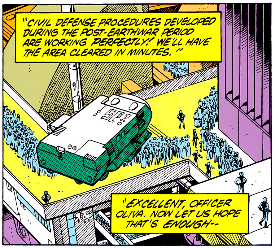
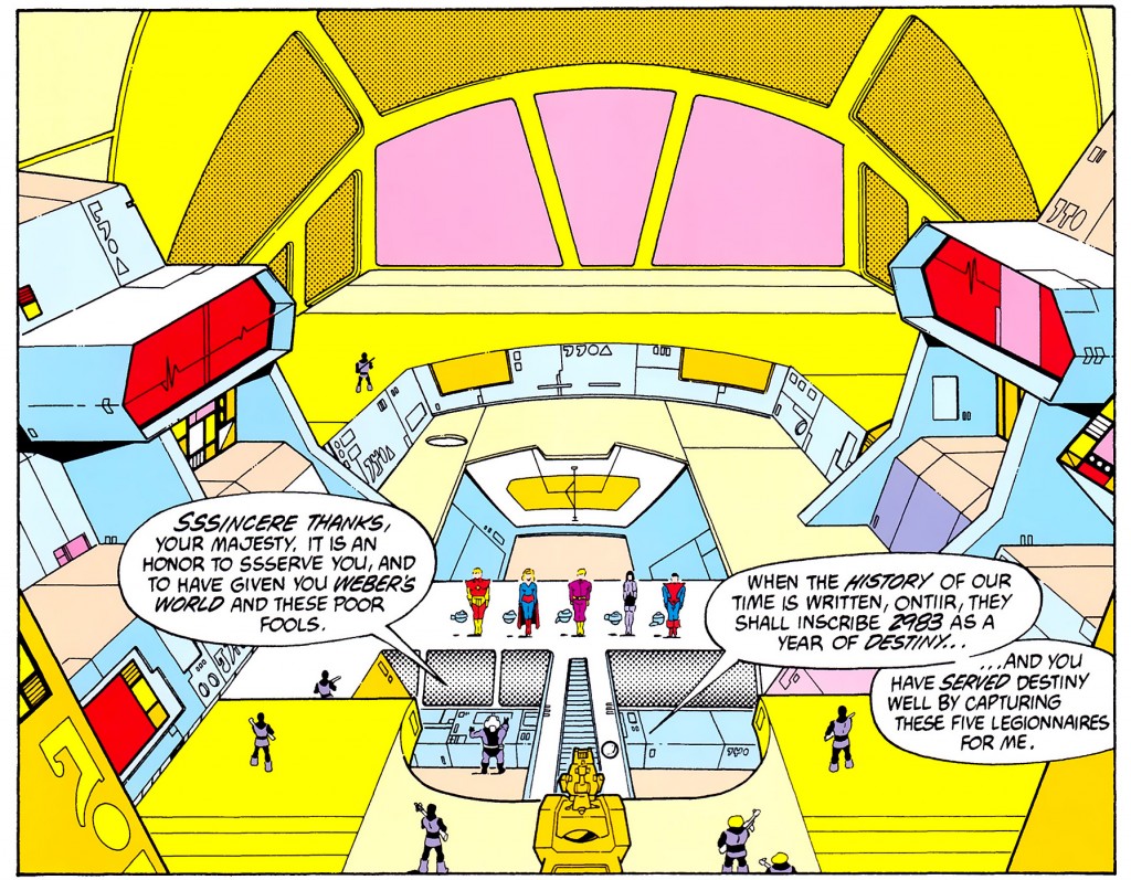
This is good perspective. The way you do this is to set your vanishing points way, way apart from each other, then do the backdrop first. Then, for the foreground, you can either set up new vanishing points or you can just move the paper. I usually move the paper.
You can see that he made tiny little errors, too. That’s no big deal on a panel this small and minor — I’m sure this is the largest this panel has ever been viewed by its audience. But it’s interesting, because it shows you how sensitive perspective is. You can see that front railing is a little bit off, and it looks like he started a set of three stairs and then forgot about them when he drew the crowd over it. No big deal, but if he’d been working bigger and slower, for a European audience, let us say, these are things he would have fixed and the page would have been that much closer to that invisible tipping point between “good” and “magic.”
I have to admit that, between Moebius and Giffen, one is good, and the other is magic.
Moebius was doing a different thing, for a different market. Giffen was trying to crank out a plausible future on a monthly basis, whereas Moebius was just drawing whatever he could remember from his mushroom trip.
Moebius is probably better. I mean, look at this stuff:
http://www.domusweb.it/content/dam/domusweb/en/architecture/2010/06/16/the-city-in-the-comics/big_255328_4924_MOEBIUS_big.jpg
http://therealmcast.com/wp-content/uploads/2012/03/Moebius-landscape.jpg
http://dailypop.files.wordpress.com/2009/12/moebius_long_tomorrow.jpg
But Giffen was probably faster. You can also *see* what Giffen’s drawing a lot more easily than you can with Moebius, so I find it easier to learn from.
Basically if you could crank out awesome futurescapes as fast as Giffen you could probably slow down and do them as good as Moebius.
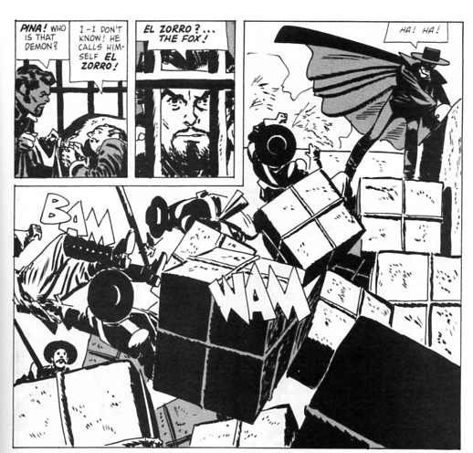
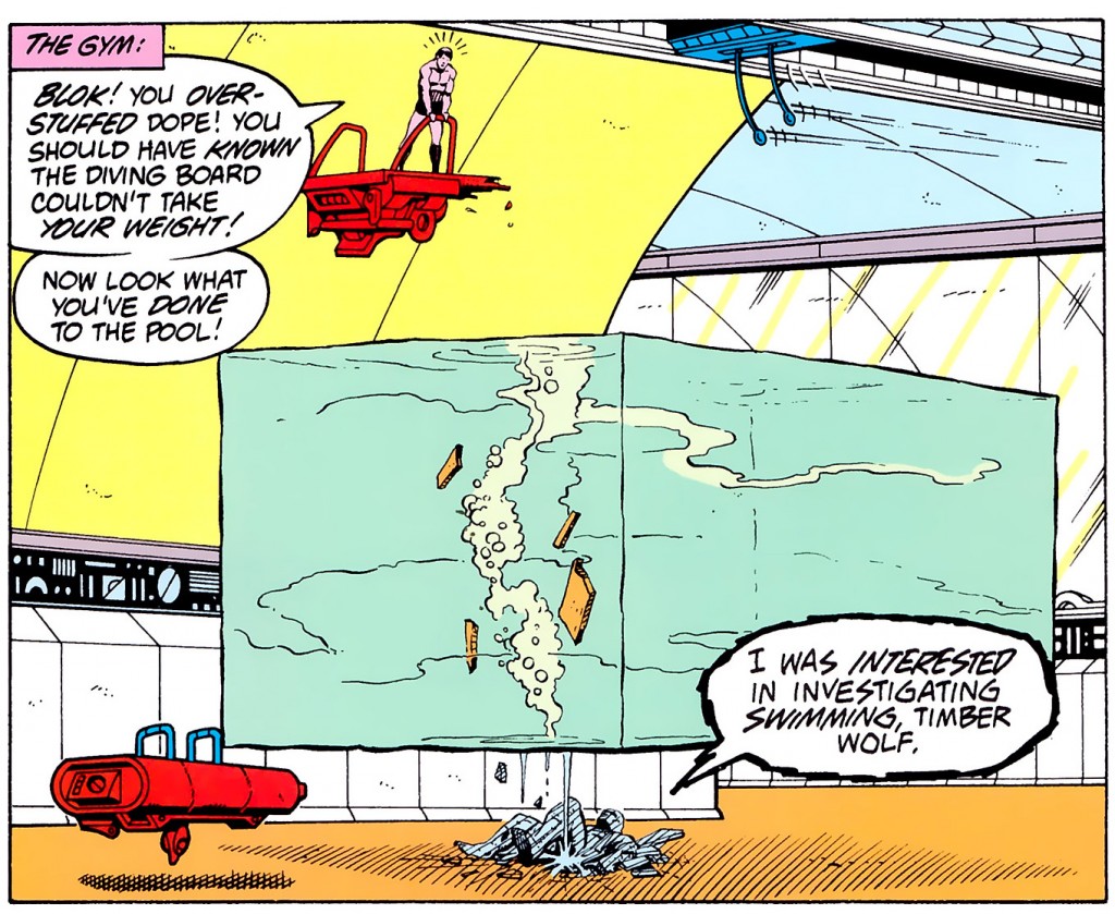
That’s one thing about Giffen — he was so accurate with his perspective that you can tell he was treating it like a job. He never did anything like this:

because he would have had to move the vanishing points too much. Toth just freehanded it because he was that good, which is not a problem Giffen ever had. Keith Giffen has never struck me as the most talented draftsman, and I’m willing to wager that he spent less time in a figure drawing class than your average Kirby. What I love about Giffen is his hard working attitude and his endless inventiveness. Giffen made it look good, but he never made it look easy.

The enduring question in my mind right now, and IT IS NOT AN IMPORTANT QUESTION, is this: did Giffen move the paper, or draw new perspective lines? Here is what I would do; move the paper, realize I forgot something, try to move it back, mess it up, fake it. Did Giffen do this or did he just have a giant, giant drawing board (or a wall, walls work better for this) with a bunch of perspective grids already worked out on it? Someday, someday, I will meet Keith Giffen, and I will ask him, and he will look at me like I am an idiot, and in that moment I will realize, yes, I am an idiot. BUT I STILL WANT TO KNOW.

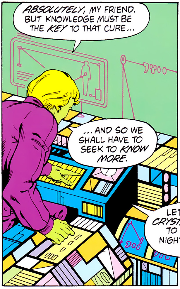
No computers for the future of the past. What we’ve got here is something like an airplane cockpit with blank screens on every surface. It ain’t exactly ergonomic — how is he supposed to see the screen on the bottom right? — but it gives the impression of mass and activity, so I guess that’s the plan? This computer would not work as a computer, but it does work as an image of a computer to give a human reader the impression of computing.

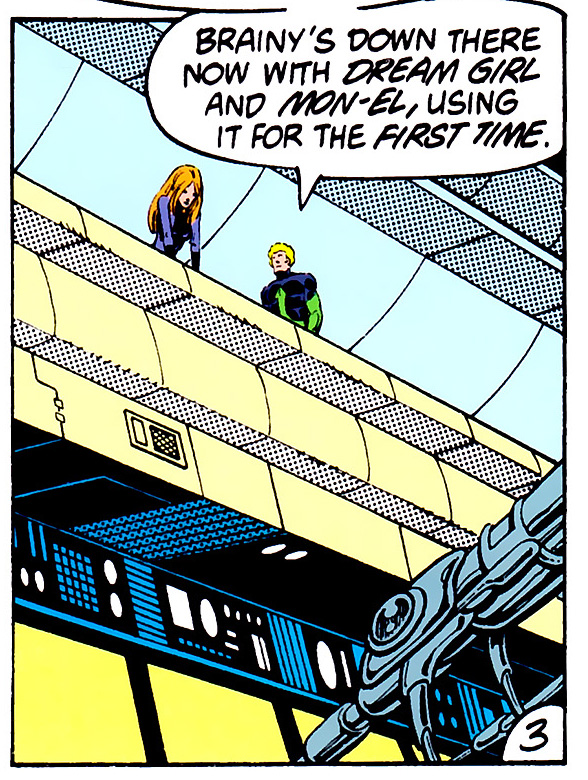
I adore these tall, narrow panels. However, if you want to talk about a storytelling conceit that just does not work for the internet, you’ve got it right here.
Note how judiciously shadow and reflection are used. Giffen just does not care to hatch, which is sort of interesting from the artistic point of view. See, hatching can’t really be done with a ruler — at least not if you want to remain sane. Hatching is the art of making a lot of little nearly-parallel lines freehand as fast as you can. Giffen was all about using a ruler and a French curve as fast as he could, and he didn’t really seem to trust himself with the hatching. Or maybe it was the inker, but you gotta admit that Giffen didn’t give him much to work with. His whole career he’s used pools of black ink for shadow and ligne claire for light. So you have solid areas of black that are used as texture and reflections that are created with single lines.
Also, that hard horizontal line above the cops is too thick. It should be feather-thin. I’d fix it but I’ll leave it as a monument to The Way The Future Was.

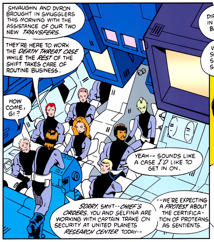
Ah, that 80s classic, the roll call in the briefing room. Why Hill Street Blues may well have been on TV as he drew this. I love the series of boxes hanging over the top of them and their impossibly small chairs — either they levitate into those things or elevate up from below. Chairs that no human being could possibly get into are an old sci fi cliche.
Those boxes on the top are interesting. They don’t do anything in the story — none of the characters can see them. They do imply that the Science Police are always looking at things, and maybe the chairs imply that they’re a bit narrow-assed about it. But the thing about the boxes above them is that they are very, very easy to draw. If you have a ruler and you aim to fill space, you can fill that space in about ten minutes, beginning to end, you’re done.
Always remember that it’s easier to draw something the first time than it is to copy it. Copyists and analysts are worried about getting it right. The originator is just worried about playing a simple game. Let’s fill this space, say something about the characters, and get paid, using only this ruler and this pencil. Bam. Tiny inlaid boxes inside other boxes, drawn in careful perspective but with no particular need to be in relation to themselves, suggest what we want to say. The Science Police are regimented, regular, serious about obeying underlying principles, and interested in watching other people. All that from ten minutes worth of boxes. Artistically speaking, that’s a good buy.

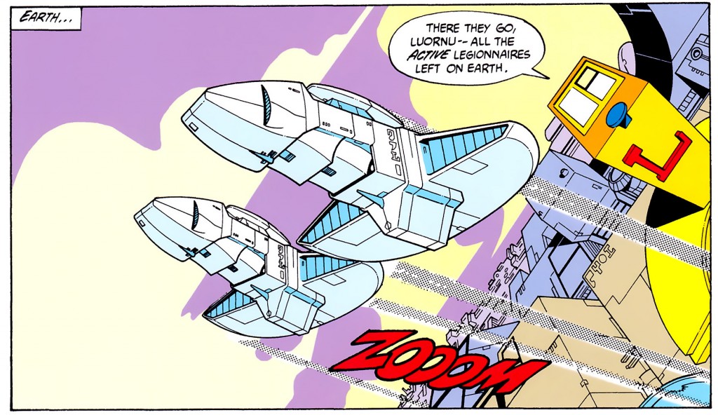
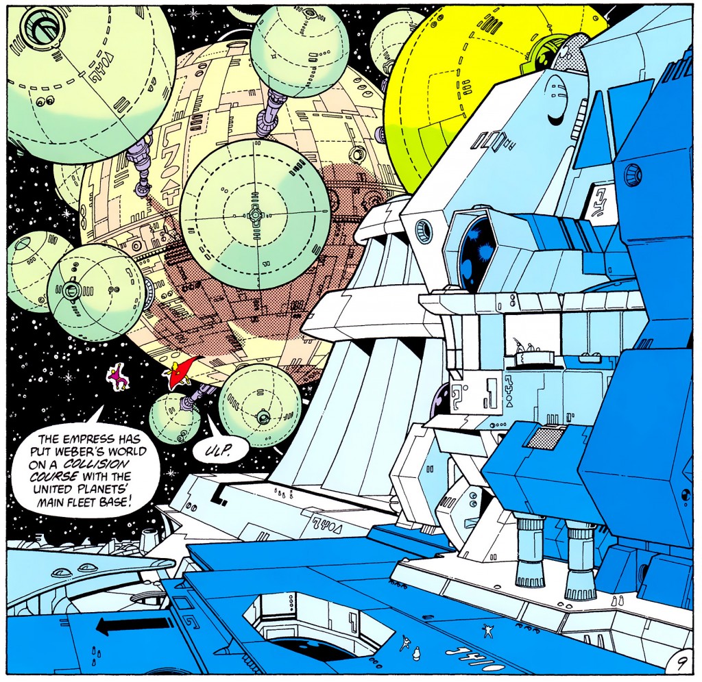
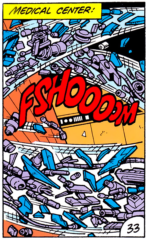
And let us bring this series to a close by firing all the guns at once. Giffen busts out two different types of perspective and manages to create some serious scale. One has the impression that those two characters, helpfully left with white space around them so the reader can find them, are trapped between an enormous ship and an even bigger planet. The ship behind them is designed to look ponderous and massive, so it has a lot of heavy details that you don’t need in outer space. Why would there be support columns in zero G? Because they make your spaceship look heavy, that’s why. Look at the tiny people standing around, who are actually smaller than the people flying between them and the ship. It does not make actual sense, but it makes visual sense, and in this case it’s better to make visual sense.
That brighter yellow circle in the top right is almost certainly a coloring mistake. Again, tiny problems that this series would never have if they’d been able to take more time on each page.
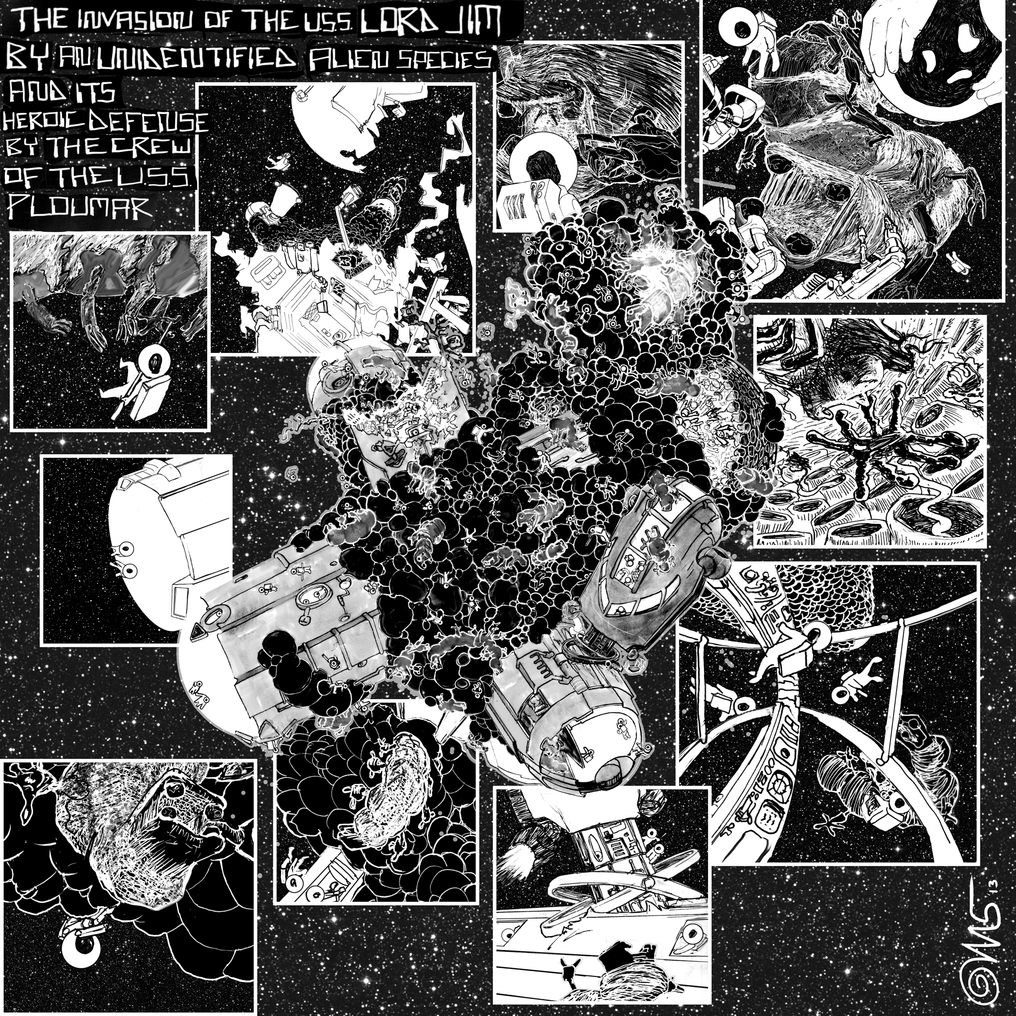
But time is a limited thing in this world, and I’m afraid that’s all the time I have left to devote to this type of analysis. It’s time to go draw my own. If you’re curious, here’s the piece that this was research for:

I don’t know if you can see where I borrowed, where I copied, and where I diverged. Trust me, they’re all there.


